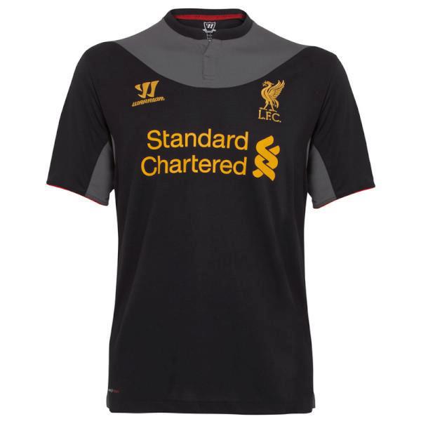


![]() by RED BEERGOGGLES » Fri Jun 22, 2012 2:30 pm
by RED BEERGOGGLES » Fri Jun 22, 2012 2:30 pm

![]() by Raoul » Thu Jul 05, 2012 8:10 am
by Raoul » Thu Jul 05, 2012 8:10 am

![]() by Roger Red Hat » Thu Jul 05, 2012 9:14 am
by Roger Red Hat » Thu Jul 05, 2012 9:14 am

![]() by parchpea » Thu Jul 05, 2012 1:01 pm
by parchpea » Thu Jul 05, 2012 1:01 pm
![]() by Roger Red Hat » Thu Jul 05, 2012 2:51 pm
by Roger Red Hat » Thu Jul 05, 2012 2:51 pm
![]() by Reg » Thu Jul 05, 2012 2:54 pm
by Reg » Thu Jul 05, 2012 2:54 pm

![]() by Benny The Noon » Thu Jul 05, 2012 3:00 pm
by Benny The Noon » Thu Jul 05, 2012 3:00 pm
![]() by Roger Red Hat » Thu Jul 05, 2012 3:32 pm
by Roger Red Hat » Thu Jul 05, 2012 3:32 pm
![]() by mart » Thu Jul 05, 2012 7:37 pm
by mart » Thu Jul 05, 2012 7:37 pm
Reg » Thu Jul 05, 2012 6:30 pm wrote:If Stevie ran out onto the field with a turd on his head some people would clap.
![]() by Reg » Thu Jul 05, 2012 8:12 pm
by Reg » Thu Jul 05, 2012 8:12 pm
mart » Fri Jul 06, 2012 2:37 am wrote:Reg » Thu Jul 05, 2012 6:30 pm wrote:If Stevie ran out onto the field with a turd on his head some people would clap.
It would be impressive if he managed to balance a turd on his head while running. I'd clap.
![]() by RED BEERGOGGLES » Thu Jul 05, 2012 10:48 pm
by RED BEERGOGGLES » Thu Jul 05, 2012 10:48 pm
mart » Thu Jul 05, 2012 6:37 pm wrote:Reg » Thu Jul 05, 2012 6:30 pm wrote:If Stevie ran out onto the field with a turd on his head some people would clap.
It would be impressive if he managed to balance a turd on his head while running. I'd clap.
Return to Liverpool FC - General Discussion
Users browsing this forum: No registered users and 89 guests

